Designing for Measurable Growth
Iterative Optimization Across Funnels, Campaigns, and Content Strategy — Money.com. Growth wasn't a feature request there — it was the product. Over three years, I designed directly against conversion, acquisition cost, and engagement data, running structured tests that moved real numbers, while leading a four-person design team, a role that became official with my promotion to UX Design Lead & CRO Specialist.
Contents
Highlights
- 0.1Company-wide testing methodology across 100+ verticals, built on a behavioral-science framework, with a cascade method for rolling winning tests across verticals
- 0.2Individually-tested Life Insurance funnel iterations — no bundled changes, no guessing at what worked
- 0.3Reframed a national TV campaign into a lead-capturing tool that gave users real value
- 0.4Proposed a Money101 IA restructure with achievement-driven content discovery to lift SEO-driving engagement, even though it wasn't launched
The situation
Growth wasn't a feature request — it was the product.
Before any funnel could be optimized, the business needed a real way to decide what to test and why.
Money Magazine was in the middle of a real transformation. Before the Money.com brand, the company operated ConsumersAdvocate.org, an affiliate marketing platform spanning more than 100 verticals, from car insurance to pet insurance to mortgage rates to home security, connecting people comparing options with the companies advertising in each space. As it moved into Money.com, and from a print publication into a digital-first platform, it also had to build genuine brand recognition as a newer digital entrant. That created a design tension: user testing showed that Money's publication history was a meaningful trust signal, so the work had to modernize the experience without discarding the credibility that history provided. With that many verticals to optimize and that much trust to protect, testing couldn't be scattershot. It needed a system.
I built that system on a motivational framework. It started from the Fogg Behavior Model, applied to the personas in each industry, with Self-Determination Theory to work out the psychological needs driving each audience. Then I used Cialdini's seven principles of persuasion to create a weighted cloud capturing how important each principle was to those personas.
The testing process was built on that framework. The cloud framed our A/B tests, giving each round a focus and letting us make educated guesses about what would perform, so we could prioritize future test releases by evidence. I also devised the "cascade method": when a test in one vertical showed marked improvement, we could launch that same test quickly in other verticals, maximizing our efficiency without compromising the quality of the results. We also tried the throw-it-at-the-wall-and-see-what-sticks approach: it sometimes produces outcomes, and it's important to think outside the box at times. It's the foundation everything below was built on — not a one-off win. That process drove CTR gains across verticals — 3.78% on Car Insurance, 2.68% on Mortgage Rates, 7.89% on Pet Insurance, 5.65% on Health Insurance — and a six-figure quarterly earnings increase that earned the company-wide 2019 Innovator of the Year award.
The approach · Initiative one
Turning discipline into a lift.
No bundled changes, no guessing at what worked.
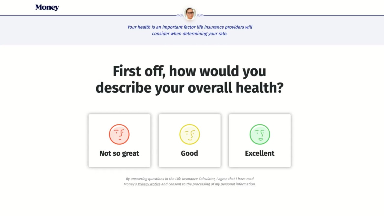
Money.com's Life Insurance funnel carried that same rigor forward. Using Amplitude to analyze drop-off, I tested changes individually against a control — reordered questions, a progress bar, loading interactions, security assurances, a trust-building helper persona ("Sara"), animated buttons, and mobile responsiveness. No single change was dramatic; the discipline was in testing each one honestly. That approach compounded into a 7.2% lift in Click-to-Lead.
1.0Life Insurance funnel — individually-tested iterations
The approach · Initiative two
Making brand spend do double duty.
A national TV campaign, reframed from pure exposure into a lead-capturing tool.
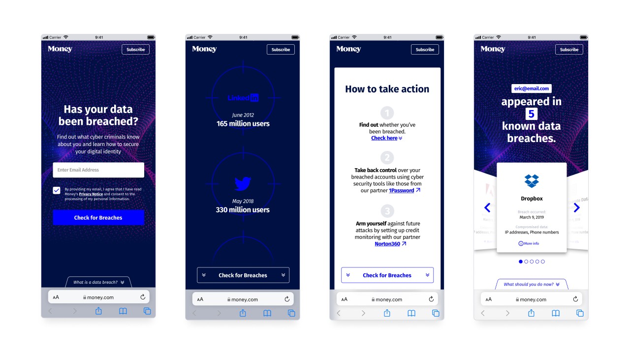
In late 2019, Money.com set out to push the brand into the mainstream with a national TV campaign: two commercials that ran 85 times across major cable networks, including CNN, Fox News, Lifetime, TBS, TNT, USA, and VH1. I pushed past pure brand exposure: a data-breach checker tool, aligned with Money's brand value of financial trust, that gave users real value — educating them on how a breach affects their finances — while capturing genuinely new leads, not just re-engaging people who already knew the brand. I also designed a homepage takeover to bridge the move from TV to web with as little friction as possible, built around an easy-to-remember URL so nobody had to retain anything complex from a 30-second spot. The campaign converted at $0.18 cost per acquisition, and 85.9% of those converts had never heard of Money.com before.


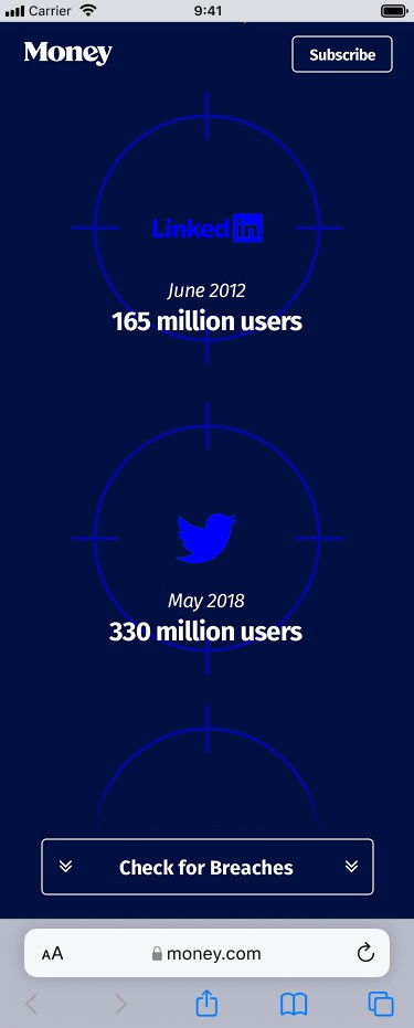
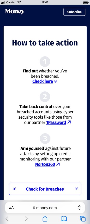
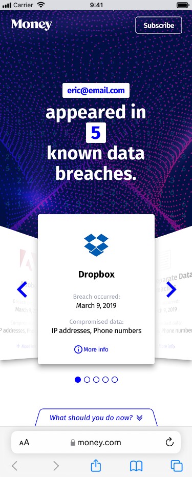
1.1National data-breach campaign — commercial backdrop, in-app flow, QR code
The approach · Initiative three
Reshaping the ask, even without a launch.
Looking at the data before executing a simple visual refresh request.
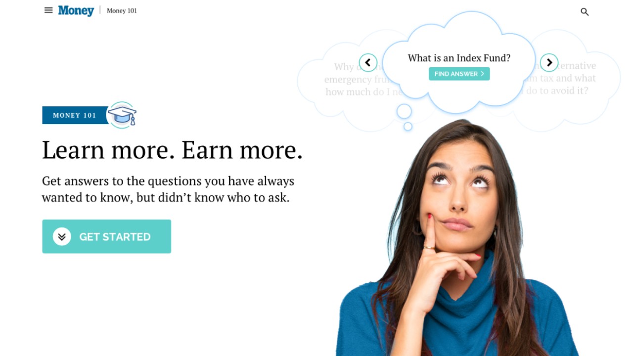
Money101 started as a simple request: refresh a content hub page with better images and more clickable CTAs. Before executing it, I checked the engagement data and found the hub itself wasn't the problem — users were arriving via keyword search, landing directly on individual articles, and bypassing the hub page entirely. A visual refresh of a page almost no one saw wouldn't move the metric that actually mattered.
Using Google Analytics and working directly with the editorial and SEO teams, I proposed restructuring the information architecture instead: organizing articles into topics and groups with drill-down navigation, and surfacing related articles matched to the search intent that brought a user in, right on the article page itself. I also layered in light achievement mechanics, such as progress and achievement markers, to encourage people to keep exploring once they'd arrived. Session depth and continued engagement are themselves SEO signals, so getting someone to read a second and third article wasn't just a nicer experience for that user — it fed back into the same search visibility that brought them there in the first place.
It never launched — the business prioritized SEM work at the same time — but the judgment call is the point: I looked before executing, and reshaped the problem based on what I found.
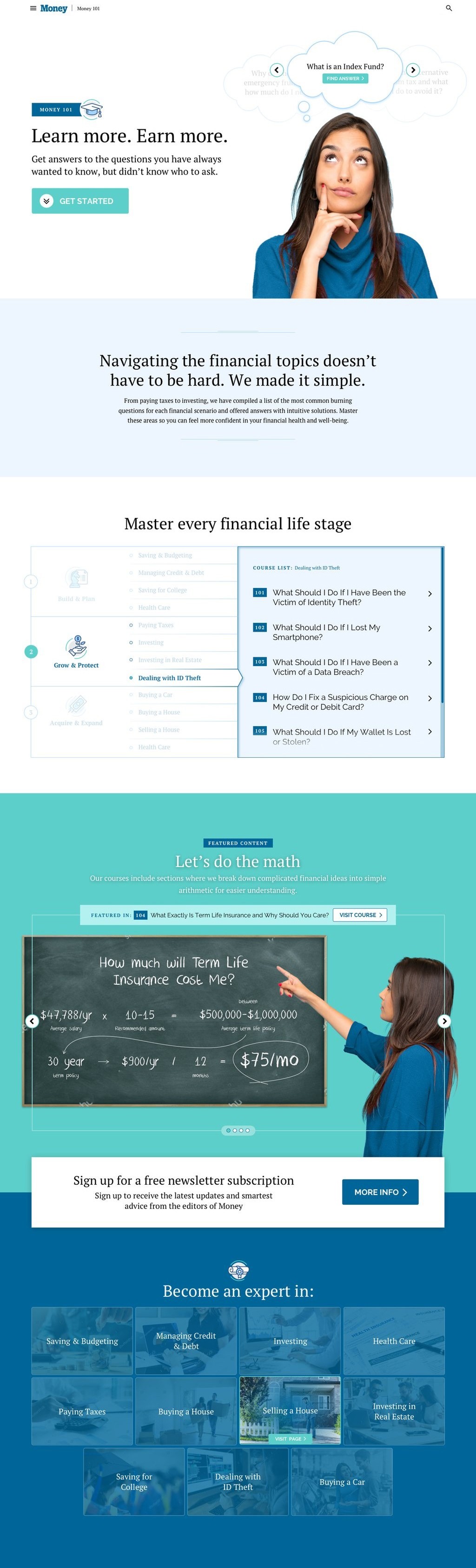
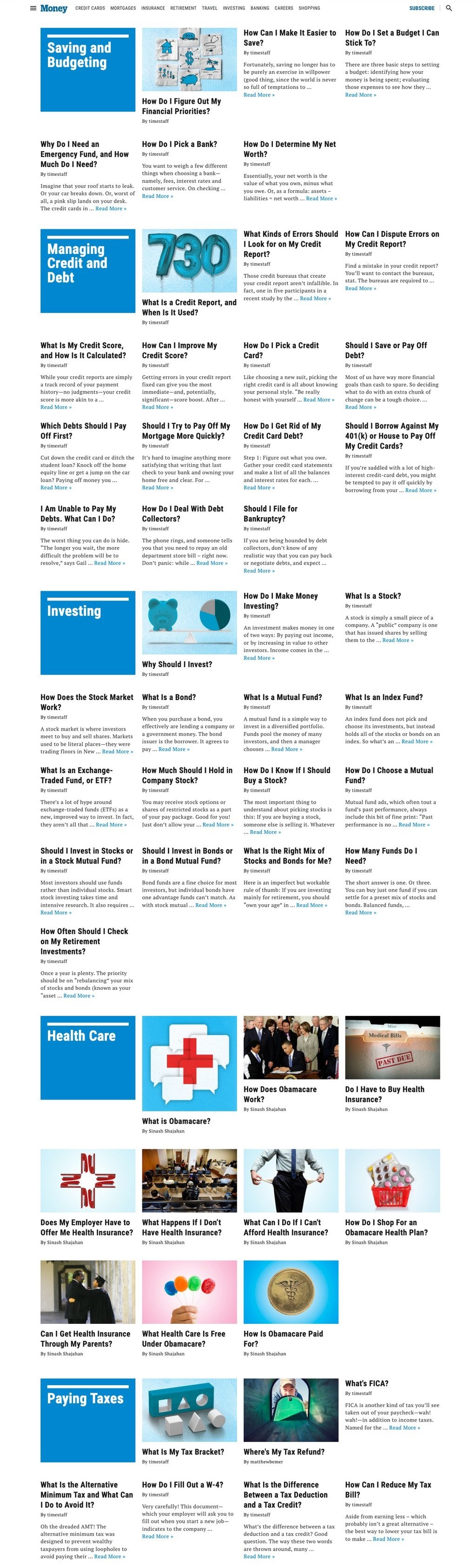
1.2Money101 — before/after comparison (drag the divider, scroll or drag to pan)
Outcome
A track record of moved numbers.
Over three years, this testing discipline scaled from a single funnel to a company-wide process spanning 100+ verticals, earning a company-wide 2019 Innovator of the Year award along the way. I also operated as the de facto lead of a four-person design team (myself and three others I held one-on-ones with) — running syncs, reviews, and critique — before the role became official with my promotion to UX Design Lead & CRO Specialist.