Money
1.) Money Rebrand
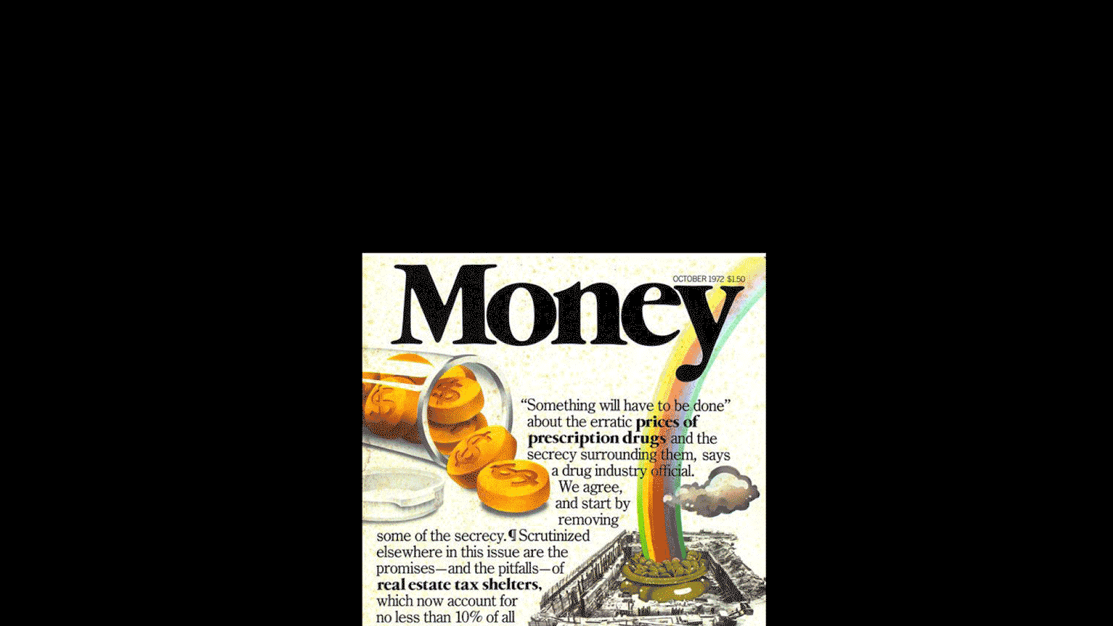
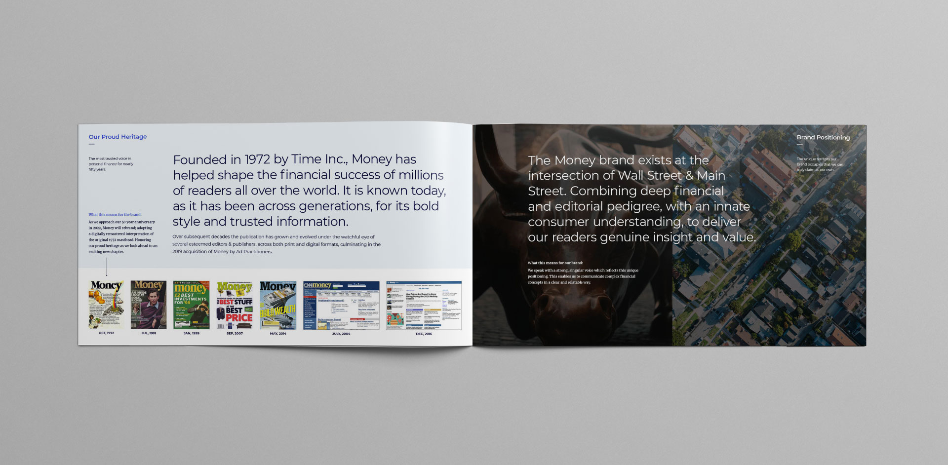
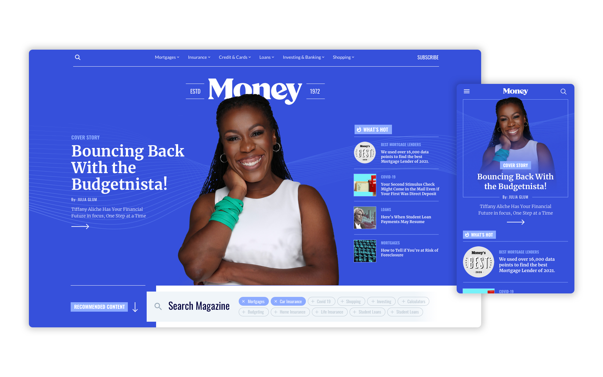
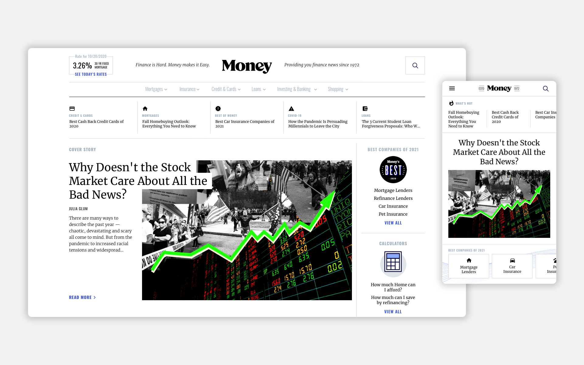
The transition from publication to digital content was never addressed formally until June of 2021. The need for a fresh new look was long overdue but we wanted be careful to not ignore where we came from. Paying homage to our roots became the strategy after we discovered through user testing that our publication history was instrumental in users' perception of us as a trusted source.
Optimizing performance through metrics such as returning visitors as well as a combination of time on page + click through on the homepage.
| Company: | Money.com |
| Date: | 06.11.2021 |
| Role: | UX/UI Designer, Brand Direction, Design Systems Creator |
Task
Create a brand that will become recognizeable and mainstream.
Idea
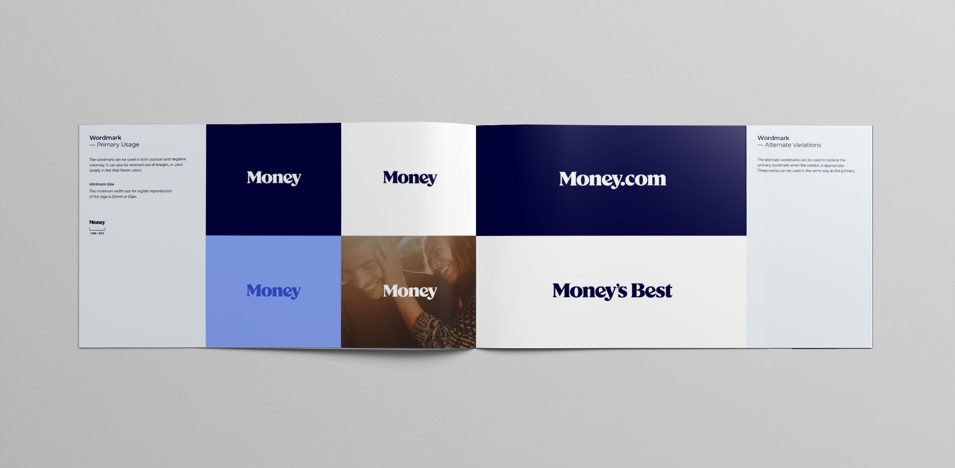
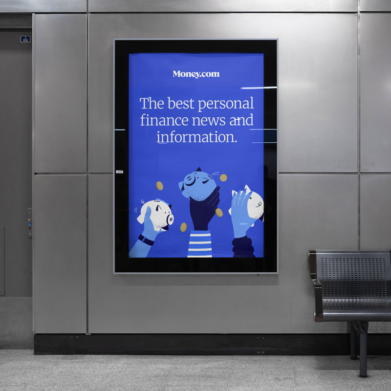
With an easy url to remember, the strategy was to enhance recall by producing alternative variations of the word mark that could be applied on ads. Success indicators include tracking engagement after campaign launches, and tracking unique visitors for certain IP addresses for large display ads.
Task
Create a look and feel that would align with business goals and objectives
Ideas
- Target the untapped potential discovered by market reserarch of the cost-conscious young adult (18-32) demographic who are seeking financial advice
- Create a trust-worthy feel, a value that our audience heavily leaned towards during our research
- Cater to our current userbase, a loyal and vocal group that has expressed pessimism on the direction of the company
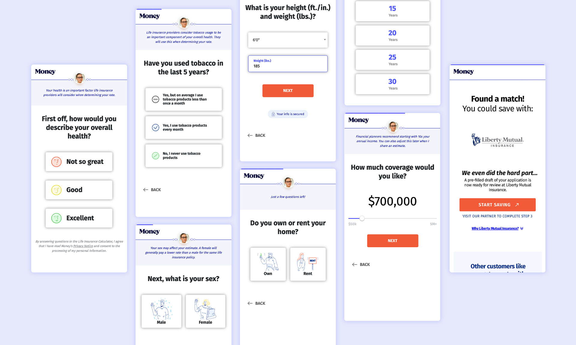
2.) Life Insurance Funnel
At Money.com we specialize in affiliate marketing and conversion optimization. This life insurance funnel is the culmination of many iterations and tests we've run to diagnose issues and prescribe remedies.
Notable enhancements that improved downfunnel conversion include the progress bar for gamefication and accomplishment, "Sara the helper" for brand authority and trust, animated buttons on step 1 to initiate engagement, and animated loading screens to maintain the feeling of progress.
| Company: | Money.com |
| Date: | 06.11.2021 |
| Role: | UX/UI, Interaction Design |
Task
Optimize the funnel to boost leads for our partners
Ideas
- Add "Sarah the helper" for brand authority, trust, and justification for entering P.I.
- Re-arrange questions to improve momentum
- Animated buttons at beginning to try to improve initiation of the engagement
- Add a progress bar to communicate accomplishment
- Add animated loading screens to indicate progress
- Add "secured" lock for P.I. Questions
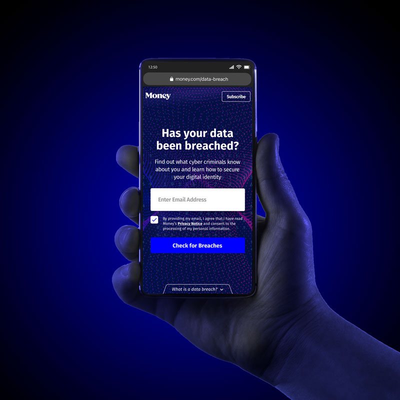
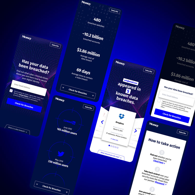
3.) Has Your Data Been Breached?
In November 2019, Money.com set out to push it's brand into the mainstream and become a household name. The solution was to create a series of products and campaigns that would collect user contacts.
We created and launched 2 commercials that ran 85 times total on cable channels such as CNN, Fox News, Lifetime, TBS, TNT, USA, and VH-1. By the conclusion of our campaign our cost per acquisition was 18 cents, and 85.9% of our respondents had never heard of Money.com, increasing our potential for developing new loyal users.
| Company: | Money.com |
| Date: | 12.20.2020 |
| Role: | Design & Concept Manager for product and video, UX/UI Designer, User Flow Designer |
Task
How do we get users to transition from the television to the phone with the least amount of brain power as possible, while promoting name recognition?
Idea
We create a homepage takeover that advertises our own product so the user will only have to remember the core, easy-to-remember url.
Money 101 SEO Play
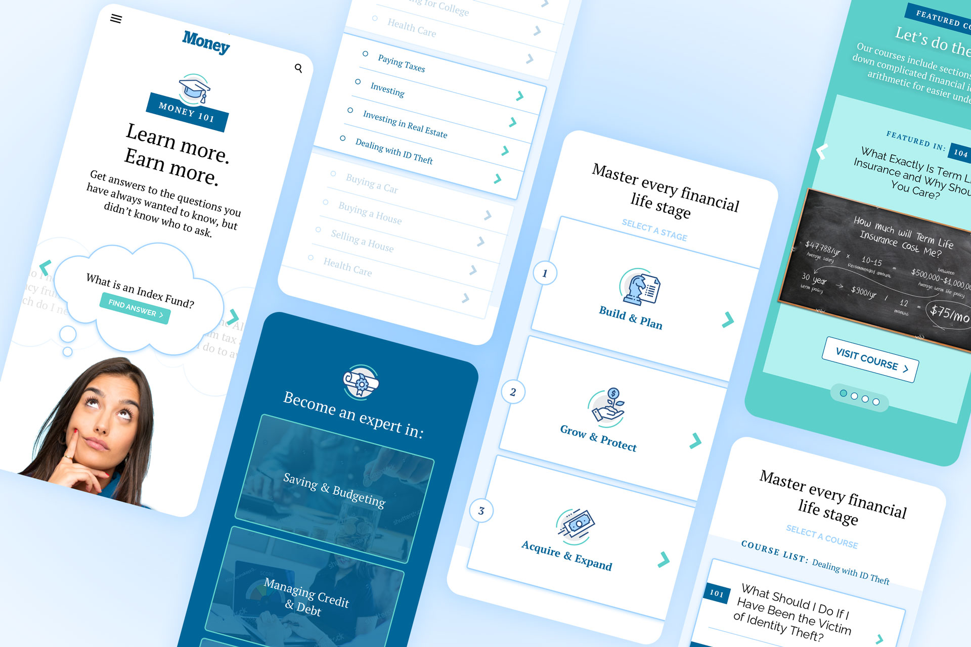
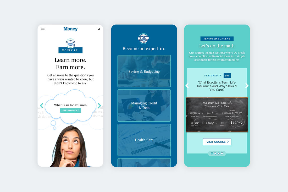
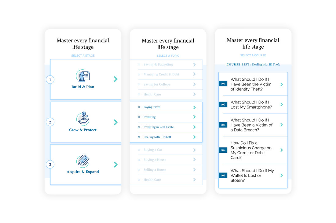
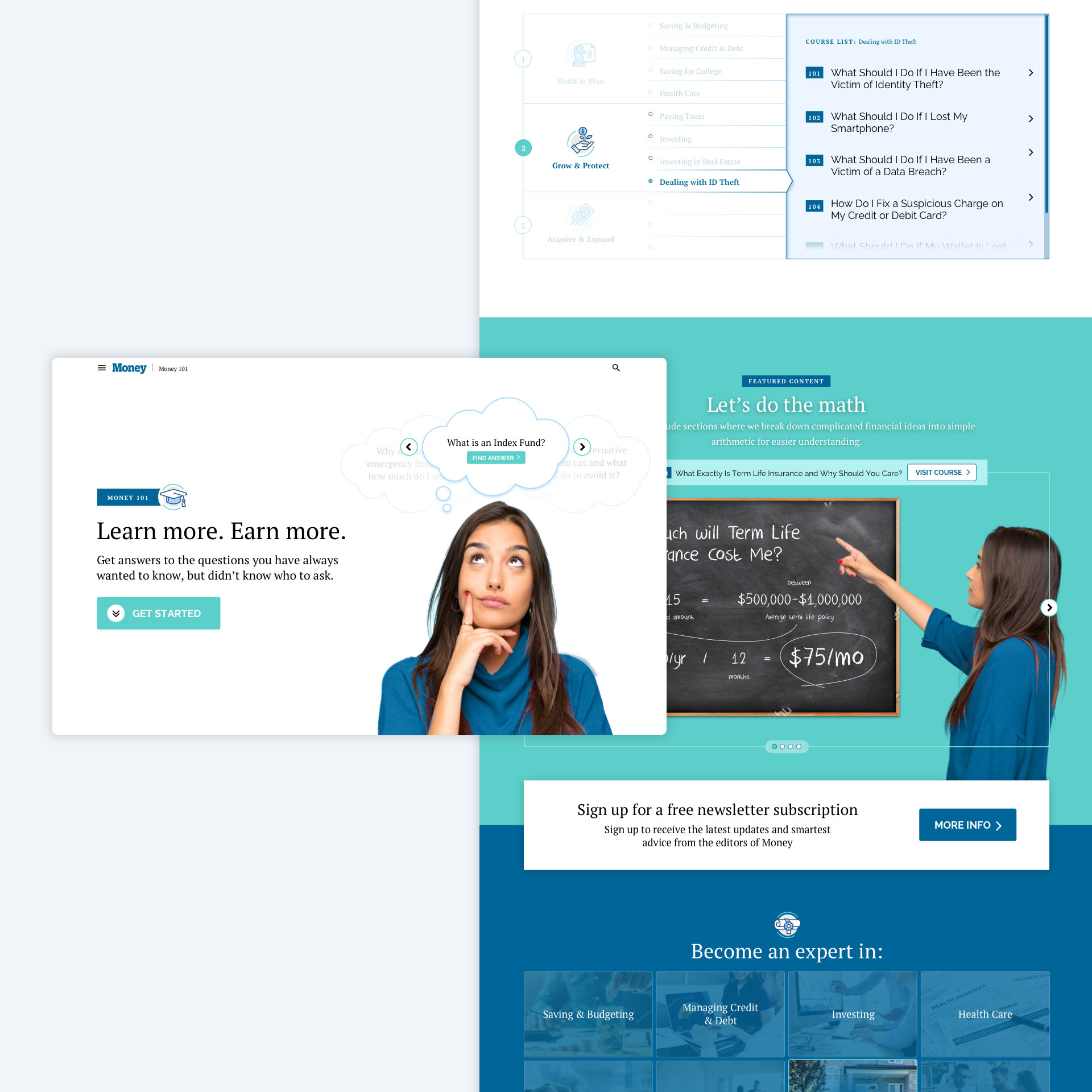
Money.com had a collection of topics that were grouped together because of their SEO friendly titles. The initial task of the project was a simple reskin of the hub where they all resided, however, once I took a look at the engagement metrics and the organization of the content I saw that there was more potential for growth.
Since all these pieces of content spoke about finance at a beginner level there seemed to be an opportunity to encourage reengagement so the audience could continue to learn more about finance. Together with the editorial and SEO team, we organized the articles into topics and then groups to create a drilldown level of navigation so we could create and educational hub called Money 101.
| Company: | Money.com |
| Date: | 03.01.2019 |
| Role: | UX/UI Design, IA |